The CSS Calc Function
|
I was quite excited when I first read an article on the CSS calc function. For real, the ability to perform calculations in CSS with different units is definitely awesome. It's even more awesome when you actually make use of it practically. So in this article, we will learn about the CSS calc function and then get to a use case of this function. Let's get started right away.
The CSS Calc Function
The CSS calc function is used to perform calculations when specifying values of CSS properties. It can be used where any numerical value can be used. It takes an expression as its parameter and uses the result as the value of the CSS property where it is used. We can perform addition +, subtraction -, multiplication *, and division / with it. Cool right? Here's a simple example.
div {
    width: calc(100% / 3);
}
So in the example above, the value of the width used is the result of the evaluation of 100%/3.
The exciting part of the calc() function is the ability to mix units. That means you can perform calculations with different CSS units like viewport width(vw) and pixels(px) and still get valid results. This is where the CSS calc function sets itself apart from calculations done by preprocessors. Preprocessors cannot do this since it is done at render time. Let's play a little with this.
div {
    height: calc(100% - 2em);
    width: calc((100% - 20px) / 3);
}
You might not see how this works right now, but hold on, we'll get to a practical use soon. First, there are rules that should be followed when using the calc function. Let's consider them.
The Rules
-
When using multiplication, at least one of the arguments must be a number. When using division, the right-hand side must be a number. So,
calc(100px * 20px)andcalc(700 / 40px)are invalid whilecalc(100px * 20)andcalc(400px / 40)are valid. -
The addition and subtraction operators i.e.
+and-must be surrounded by whitespace. Therefore,calc(100%-2rem)calc(100%+ 2rem), orcalc(100% -2rem)will not result to a valid value. The correct syntax iscalc(100% - 2rem)with whitespace before and after the operator. -
Division by zero results in an error.
-
Nesting calc functions is allowed. In that case, the nested functions are simply treated as parentheses.
Browser Support
The calc function has an amazing browser support all the way back to IE9. Visit [Can I use](https://caniuse.com/#feat=calc) to check out the details. If you write code for older browsers or Opera Mini, consider using a numerical value as a fallback.Let's jump to one use of the calc function that's super cool.
Responsive Typography
Well, it's more like fluid typography and responsive typography. This is making your text appear well in any screen size without an extensive use of media queries. Recently, I had to work on a project where the text had to be responsive. Here's a formula I found useful.
font-size: calc(min font-size + font range * (100vw - min screen size)/ screen range);where font range = max font-size - min font-size and screen range = max screen size - min screen size.
Let's put this formula to work. We want a heading to be 24px on a screen with a width of 600px and 70px on a screen with a width of 1400px. So our font range is 70 - 24 which is 46 and our screen range is 1400 - 600 which is 800. Putting all of these into the formula, we have:
h1 {
    font-size: calc(24px + 46 * ((100vw - 600px) / 800));
}
Here's how it works.
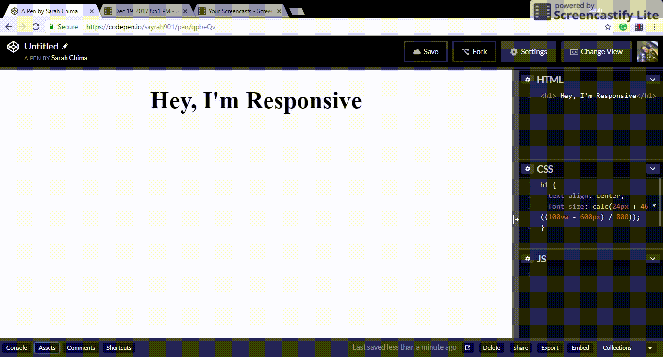
Notice that the text gets really small as the screen gets smaller. This can be combined with media queries to make it look great on all screens. You can refer to this article for a detailed explanation of a variant of this formula and how it can work with media queries.
These are some articles on more use cases of the calc function. A Couple of Use Cases for Calc() Calc() by MDN.
How do you use the Calc function? I'll love to know. Please leave a comment.
Got any question or addition? Leave a comment.
Thank you for reading. :)