Image Popup on hover
|
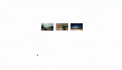
Recently, I had the task of making an image popup on hover. This gif above describes what I mean. I did not know how to do it but after some minutes of googling, I found a technique that makes it quite easy to implement and uses no JavaScript. This technique is placing two images side by side, the thumbnail image(smaller image) and a larger image which will appear when you hover over the thumbnail image. Let's do this
First Step:
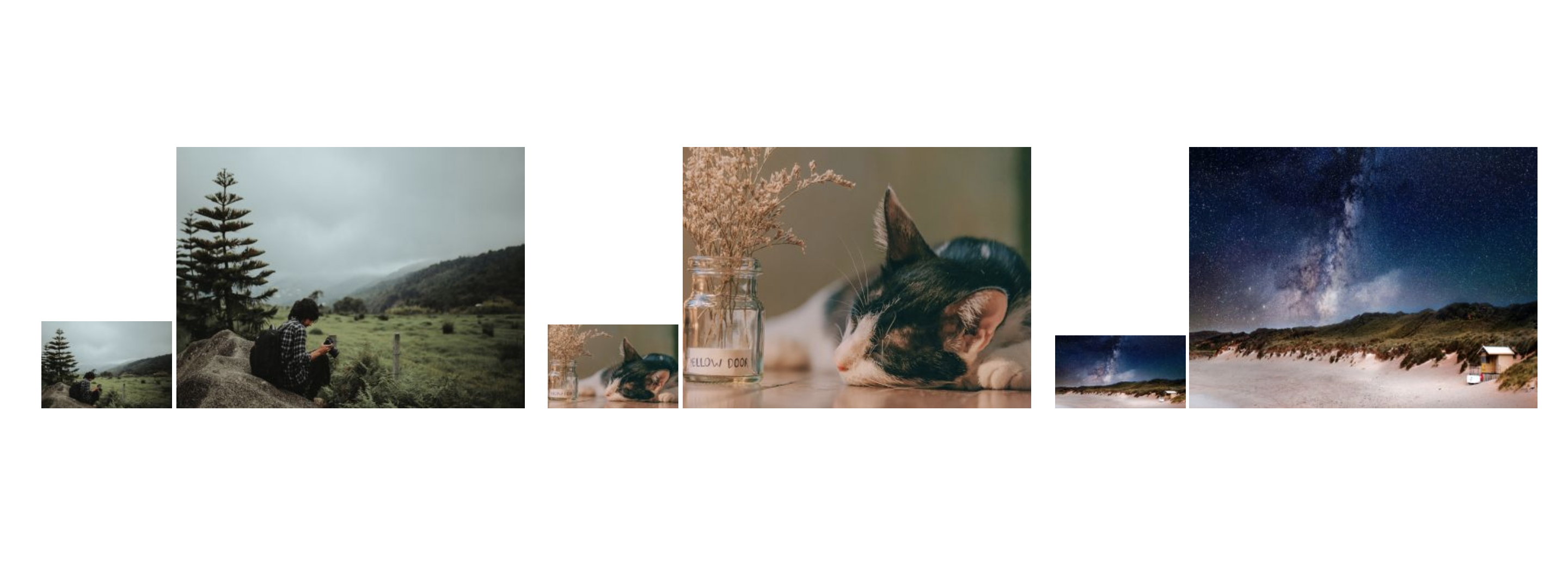
We will be placing the two images side by side, the thumbnail image and the larger image as seen in the block of code below. So in your HTML file, add the following code and remember to properly link your image files.
<main>
  <ul>
    <li>
      <img src="img/thumbnail1.jpg" alt="adventure" >
      <span class="large">
          <img src="img/large1.jpg" class="large-image" alt="adventure" >
      </span>
    </li>
    <li>
      <img src="img/thumbnail2.jpg"" alt="cat" >
      <span class="large">
         <img src="img/large2.jpg" class="large-image" alt="cat" >
      </span>
    </li>
    <li>
        <img src="img/large3.jpg" alt="adventure" >
        <span class="large">
          <img src="img/large3.jpg" class="large-image" alt="adventure" >
        </span>
    </li>
  </ul>
</main>
Since we are using an unordered list, we will style the ul and li in our CSS to remove the list style. Also, we make all the list items to appear inline and the image to appear styled. To your CSS file linked to the HTML code add the following:
ul {
	display: flex;
}

li {
	list-style-type: none;
	padding: 10px;
	position: relative;
}
Now, this is how our page should look.
Second Step
Next, we will visually hide the larger image using absolute positioning. We will use the class we add to the span that the larger images were placed in.
.large {
	position: absolute;
	left: -9999px;
}
Now, only the smaller images will be left.
 Let us add some styles to make the large images pop up when you hover over the smaller images.
li:hover .large {
	left: 20px;
	top: -150px;
}
And that is all. When you hover over the small images, the large images appear.
We can decide to do more by adding a box-shadow to the images and even text under for each image. I decided to add a shadow and give the large images a border radius.
.large-image {
  	border-radius: 4px;
   	box-shadow: 1px 1px 3px 3px rgba(127, 127, 127, 0.15);;
}
So we are done. Have you ever done something similar? How did you do it? I will love to know.