Using CSS Transitions on the Height Property
|
Little effects on our web pages can make a lot of difference on the user experience of a website. When the state of an element is changed, it's pretty cool to have a visual effect to show that an action occurred. Thanks to CSS transitions, we have a wide range of transition effects that can be used on our HTML elements.
The height of an element is one CSS property that often needs to be transitioned. Sometimes, we want a part of an element to be collapsed until it is needed. That is, when a button is clicked, the height of an element increases or decreases. See more buttons and bootstrap panels make use of this technique. Transition effects come with some frameworks like Bootstrap and JQuery. Yet, CSS transitions give you a whole lot of flexibility in transitioning the height. Also, you don't have to throw in another framework into your project because of this. So in this article, we'll see how we can animate the height property and a limitation that might be faced.
Transitioning the Height
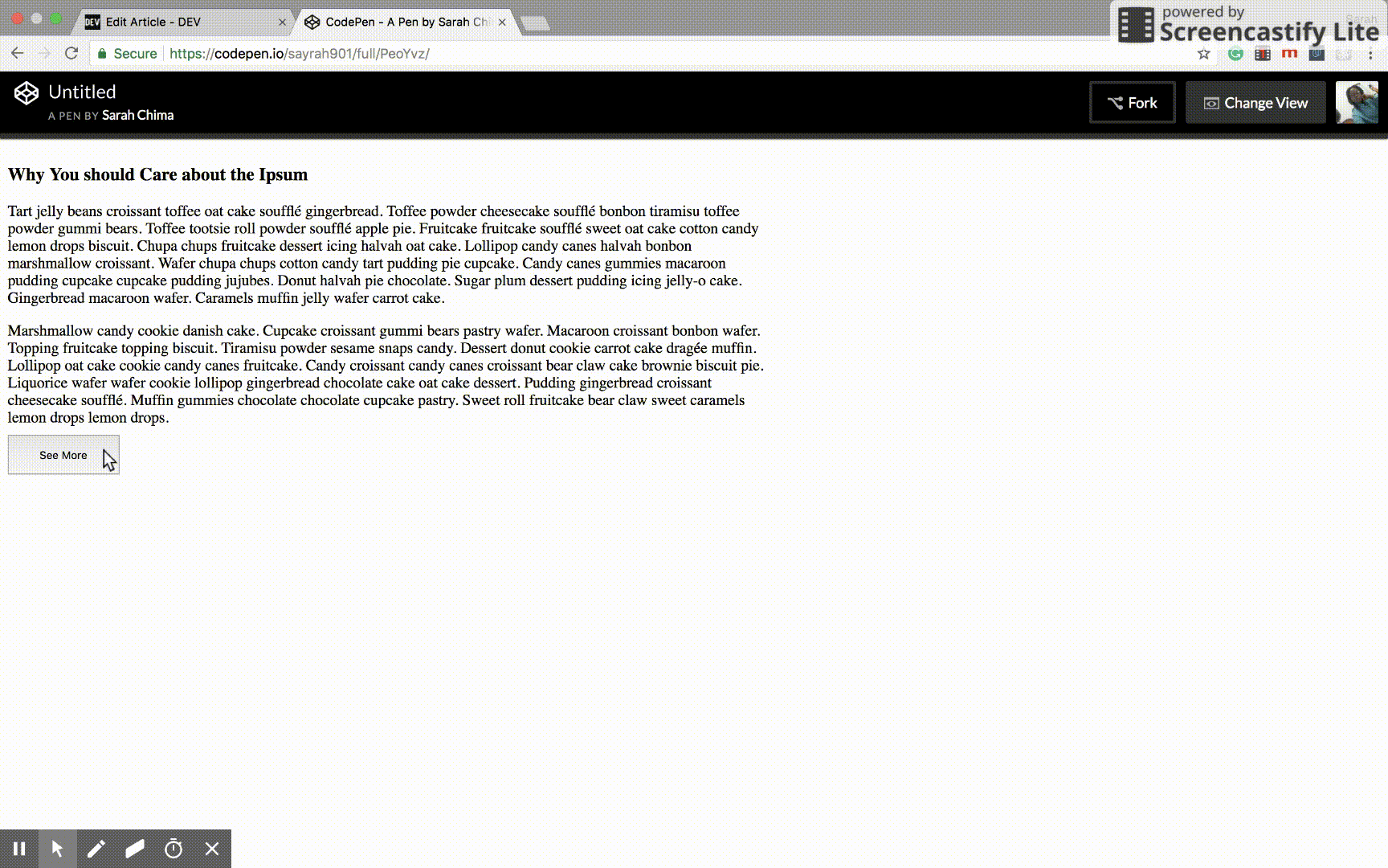
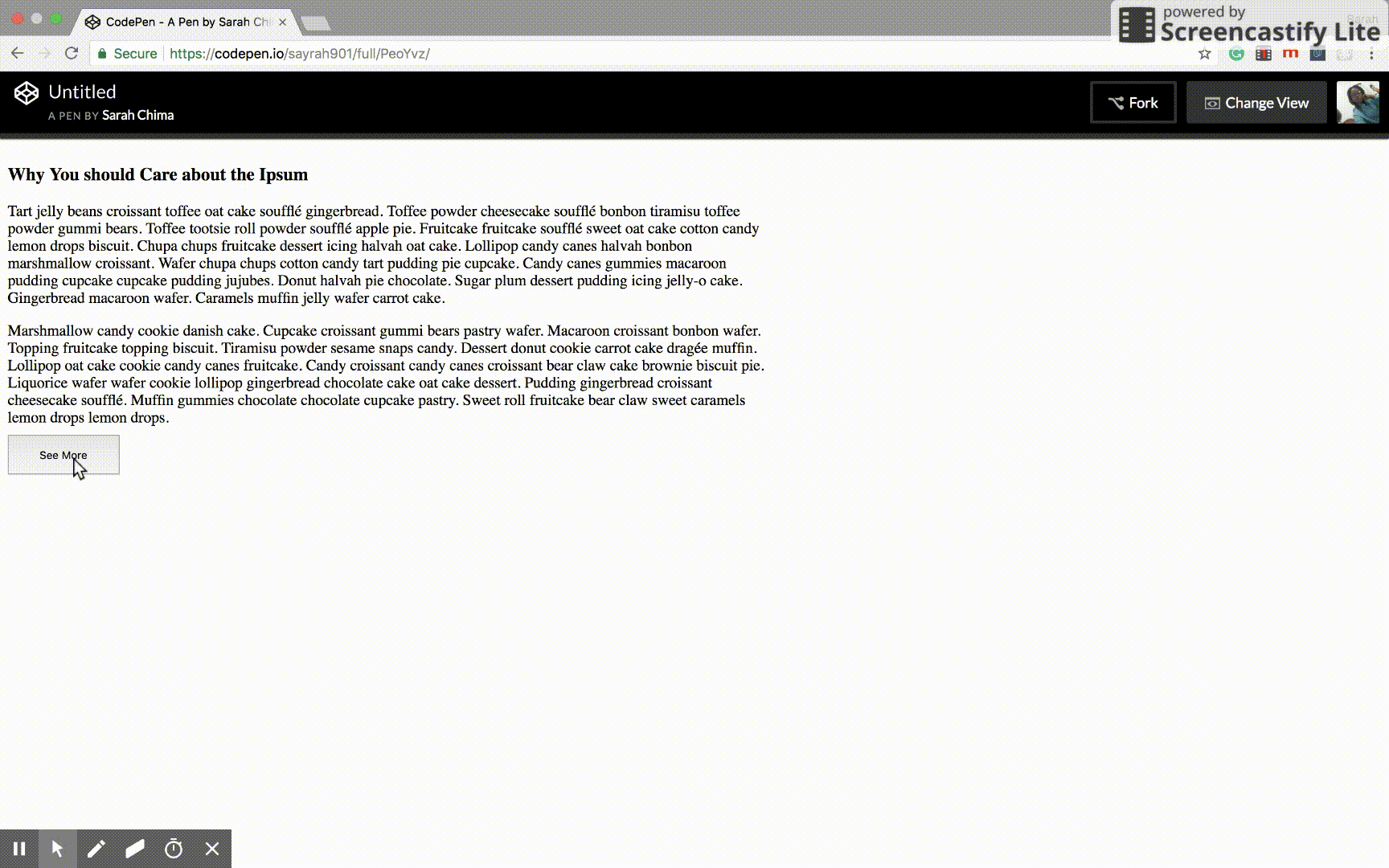
We'll be using a simple example to explain this. We have an article that we will collapse at first. Clicking on a see more button will increase the height of the element to show all the contents of the article. We will create a CSS class for this. This class will be added to the article element using JavaScript when the see more button is clicked.So first, we'll add an article element to an HTML file.
<body>
    <article id="article">
        <h3>Why You Should Care about the Ipsum</h3>
        <p>Tart jelly beans croissant toffee oat cake soufflé gingerbread. Toffee powder cheesecake soufflé bonbon tiramisu toffee powder gummi bears. Toffee tootsie roll powder soufflé apple pie. Fruitcake fruitcake soufflé sweet oat cake cotton candy lemon drops biscuit. Chupa chups fruitcake dessert icing halvah oat cake. Lollipop candy canes halvah bonbon marshmallow croissant. Wafer chupa chups cotton candy tart pudding pie cupcake. Candy canes gummies macaroon pudding cupcake cupcake pudding jujubes. Donut halvah pie chocolate. Sugar plum dessert pudding icing jelly-o cake. Gingerbread macaroon wafer. Caramels muffin jelly wafer carrot cake.</p>

        <p>Marshmallow candy cookie danish cake. Cupcake croissant gummi bears pastry wafer. Macaroon croissant bonbon wafer. Topping fruitcake topping biscuit. Tiramisu powder sesame snaps candy. Dessert donut cookie carrot cake dragée muffin. Lollipop oat cake cookie candy canes fruitcake. Candy croissant candy canes croissant bear claw cake brownie biscuit pie. Liquorice wafer wafer cookie lollipop gingerbread chocolate cake oat cake dessert. Pudding gingerbread croissant cheesecake soufflé. Muffin gummies chocolate chocolate cupcake pastry. Sweet roll fruitcake bear claw sweet caramels lemon drops lemon drops.</p>

        <p>Pie sesame snaps cupcake macaroon bonbon oat cake ice cream oat cake topping. Brownie dessert toffee brownie jelly-o chocolate jujubes halvah chocolate bar. Pudding gingerbread dessert. Bear claw tiramisu gummies pudding. Toffee marshmallow jelly beans pie marzipan caramels ice cream lollipop powder. Dragée sesame snaps sugar plum. Marshmallow sweet roll croissant tootsie roll icing. Dragée chocolate marzipan jelly cotton candy. Jujubes sweet chocolate bar candy sweet roll lollipop biscuit dessert. Danish lollipop caramels toffee pastry. Wafer candy canes cupcake chupa chups gummies lemon drops jujubes powder. Caramels danish marshmallow gummies. Jujubes muffin danish pie icing brownie.</p>

        <p>Toffee sweet tiramisu topping. Cookie fruitcake icing jelly-o sesame snaps. Caramels gingerbread ice cream pastry donut. Gummies liquorice carrot cake sesame snaps muffin toffee dragée marzipan oat cake. Chocolate bar lemon drops dessert. Sweet cupcake sesame snaps carrot cake dessert candy canes halvah tart ice cream. Jelly donut chocolate bar chupa chups tootsie roll soufflé carrot cake tootsie roll gummi bears. Pastry jujubes soufflé marshmallow toffee. Macaroon marshmallow oat cake jujubes caramels topping marzipan cupcake icing. Brownie jelly sweet tootsie roll brownie jujubes cupcake pie. Cookie lollipop ice cream tiramisu jelly-o chocolate gummies. Tart biscuit tiramisu biscuit cake tart danish topping cookie. Liquorice donut dragée tart. Dragée soufflé pudding halvah cookie marshmallow jujubes sweet roll.</p>

        <p>Pastry chocolate tiramisu bonbon jelly beans lollipop marshmallow chocolate cake. Icing carrot cake gummies cheesecake dragée. Cake fruitcake gummies. Halvah jujubes toffee pudding bonbon soufflé brownie cupcake candy. Icing biscuit cake jujubes. Chocolate bar candy canes caramels cupcake. </p>
    </article>
    <button id="seeMoreBtn">See More</button>
</body>
Here's our CSS
article {
    max-width: 800px;
    height: 300px;
    overflow-y: hidden;
}

/* This class is added when button is clicked */
article.expanded {
    height: 628px;
}

button {
    height: 41px;
    padding: 0 2rem;
}
Then some JavaScript to power up the process
const seeMore = document.getElementById("seeMoreBtn");
const article = document.getElementById("article");

seeMore.addEventListener("click", () => {
    article.classList.toggle("expanded");

    const expanded = article.classList.contains("expanded");
    if (expanded) {
        seeMore.innerHTML = "See Less";
    } else {
        seeMore.innerHTML = "See More";
    }
});
Let's add some transition to our CSS to make the content slide up and down when the button is clicked.
We'll add the transition property to the article element and thus the CSS becomes
article {
    max-width: 800px;
    height: 300px;
    overflow-y: hidden;
    transition: height 0.4s linear;
}
And now the article slides up and down.
You might think this is the part I say thank you for reading this article. No, it's not. There is a limitation that arises with this method. Let's consider it.
The Limitation
What we did above works well when the height of the article is known. What happens though when the height of the element is unknown? For instance, when dealing with dynamic content? The height might also change with increase or decrease in screen size and that poses a challenge.For dynamic content, the height of an element should be set to auto. This way, any increase or decrease in the height of the element will be accomodated. Here's the challenge: CSS transition does not work when the height of an element is set to auto. Here's what you'll get.
![height without animation] (https://res.cloudinary.com/dvj2hbywq/image/upload/v1524024293/Apr-18-2018-4_36-AM_f0tzic.gif)
The good news about this is that there is a way around this without having to resort to more JavaScript.
The Solution
The hack is to transition the `max-height` property instead of the `height` property. First, we have to estimate the greatest height our element can ever get. We then set the element to have `max-height` greater than our estimate when the element is expanded. So let's revisit our CSS again. This time we'll change our `height` properties to `max-height`.article {
max-width: 800px;
max-height: 300px;
overflow-y: hidden;
/*Transition time is increased to accomodate the height */
transition: max-height 0.7s linear;
}
article.expanded {
max-height: 1500px;
}This way the animation works and we still get the effect we want. The transition time might have to be adjusted depending on the effect you want.
Got any question or addition? Please leave a comment.
Thank you for reading :)